Presenting value-adding content is the highest priority in the market. Who can add value to the content? We surely say that data visualization. The visual data incredibly defines the story through ultimate visuals. In the same way, data visualization takes compound data and splits it into simple and attractive images. Here, it delivers the message without annoying the consumers.
Data Visualization
Data visualization helps collect insights, especially from raw data. Hence, does it lead the readers to understand visually better?
What are the different types of Data Visualizations?
When it comes to data visualization, the frequently asked queries are ‘types of chars and kinds of graphs’, and graphs express the theme of the message.
Just check the list of the most essential charts and graphs below.
Hierarchical:
Within the larger groups, these hierarchical data visualizations will order the other groups. A tree diagram is the best type of hierarchical data as its simple linear path directs to reach long.
Either from top to bottom or left to right, the arrangement of these graphs takes place.
Ring charts, sunburst graphs, dendrograms, circle packing, treemaps, etc., are other types of hierarchical data visualizations.
These formats are the best-performing types for displaying a bunch of data that originates from a single point.
Geospatial:
Mostly, the geospatial data will communicate real-life physical locations. The most advantage of these maps, we can showcase the sales and achievements acquired.
One more thing is that they are more visually attractive than other types. Most of the creators will choose it as their favorite.
The dot distribution map, cartogram, heat map, connection map, flow map, choropleth, and density plot are the most popular types of geospatial visual data.
Many users use this type of visual data in political campaigns as they have much recognition to widespread their popularity.
Temporal:
The advantage of selecting the temporal data visualization is that they are much more familiar than any other type.
Time series sequences, scatter plots, line graphs, polar area diagrams, and timelines come under temporal data visualization.
From our schooling to work, we are in touch with these temporal data visualization types. Which means we can immediately click them by recognizing them.
Multidimensional:
As the name itself defines, it has multiple dimensions. That means it has at least two variables all the time.
Frequently, multidimensional data is responsible for making eye-catching visuals due to many coinciding datasets and layers.
Pie charts, Parallel sets, Venn diagrams, Stacked bar graphs, Multiset bar graphs, Steam graphs, Stacked area graphs, Scatter plots, timetable charts, and Histograms are different varieties of multidimensional data.
Network:
The visual network data helps to demonstrate the relationships of datasets that are making connections.
By using this type of data, users can communicate with complex networks that link the data sets to one another.
Node-link diagrams, word cloud plots, alluvial diagram charts, parallel coordinates plots, matrix charts, non-ribbon chord diagram plots, and network diagram charts, etc., are different types of network data.
Data Visualization Requirements
Displays relationships between the data:
Look at the raw data in all its tabular, row, column, and numerical form to establish the built-in way to get a clear understanding of it.
An extraordinary data visualization defines the connections of data points from one another. Along with that, it generates insights quickly.
Similarly, by using data visualization tools, the quick gathering of information is possible. Even 28% faster.
Tells a story:
The narration of the data in a narrative style helps to attract the user’s attention. Storytelling always needs the best data visualization that helps to deliver a clear message from raw data.
Shows the relationships throughout time:
The best data visualization will specify the trends and patterns over large data sets depending on the application.
Social Media Data Visualization tips to boost your Content Strategy
A good content strategy always delivers successful visual content marketing. We can find many factors in establishing such a category.
Specify brand goals:
Firstly, find the goals that you want to acquire through your content exactly. Remember that unique values that content can provide your audience.
Also, find what the audience is thinking about your content after viewing it.
Define how you are going to measure the success that relates to your goals.
Audience identification:
When you are not in the position of understanding your audience, then it will not resonate with your audience.
Just raise yourself that ‘audience you ‘want to reach, the type of content they engage in, and the expectations they have on any content.
Consider Distribution:
If no one is viewing your content, then there is no use in creating the best content.
Naturally, it is a waste of time, energy, and especially money. We can find many distribution platforms like Instagram, Snapchat, etc.
As we can see, these platforms are becoming more and more popular day by day.
Make sure to disperse your content on such trending free platforms to reach a real-time audience.
Depending on the budget and goals, you have to choose the channels that fulfill your needs.
Before launching on any platform, check the type of audience and available content formats.
Chase creative:
After analyzing your audience engagement, go ahead and develop the original content.
It should reach your audience’s expectations and your goals simultaneously. Keep tracking what type of content is most valuable.
Social Media Data Visualization Tools & Platforms
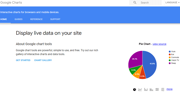
Google Charts:
It is an interactive data visualization tool, especially for mobile devices and browsers. It is simple and powerful to use. We can find a library of charts, and this enables users to customize as they need. Depending on the SVG/HTML5 technology, the charts’ executcharts’es place.
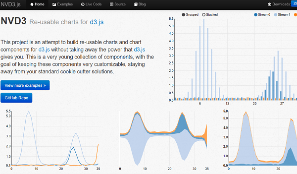
NVD3:
It helps to establish the reusable charts and components. The users can customize and can maintain all charts neatly. It is a simple interface where it provides extreme features. The front-end engineers at Novus Partners developed NVD3, and they implemented insights into the charting technology.
Datawrapper:
The users need not be professional to use the Datawrapper as it requires no coding knowledge and is too simple to use. You can easily upload, create, and publish the charts or maps. Moreover, you can integrate perfect visualizations on your site. Also, access to local area maps is possible.
Plotly:
Within a few minutes, you can create useful charts starting from a simple spreadsheet. The people from Google, New York University, and the U.S. Air Force mostly use the Plotly. It is a simple web tool, and its API is available in JavaScript and Python, which anyone can use to crack it.
Infogram:
It offers a graphic builder interface that helps to create infographics. This is also a cloud-based tool.
You can embed 550+ maps and 35+ charts into infographics. The users can even edit the data directly in the Infogram editor.
Tableau Desktop:
It is a business intelligence tool. It helps people visualize and understand the user data. You can create interactive charts and graphs in the form of dashboards and as well as worksheets to get the complete vision of the business.
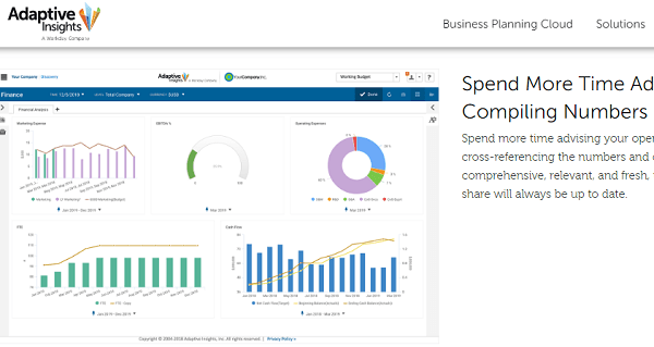
Adaptive Discovery:
Through visual storytelling, you can find the root causes and answer the queries on the spot. You can also figure out the issues. By using adaptive discoveryeronence can drive sales, financial, and operational performance.
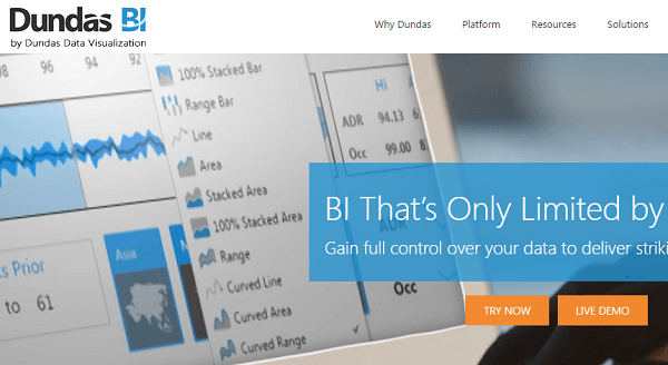
Dundas BI:
You can easily understand the data better and faster. It offers many visualization features like smart tables, gauges, data labels, indicators, relationships, numerous chart types, treemaps, sparklines, diagrams, and scorecards.
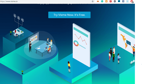
Visme:
You can give online presentations effectively using Visme. It enables you to access infographics and other visual content. It is mostly useful for small businessthatwho want to design different visualizations along with HTML animations.
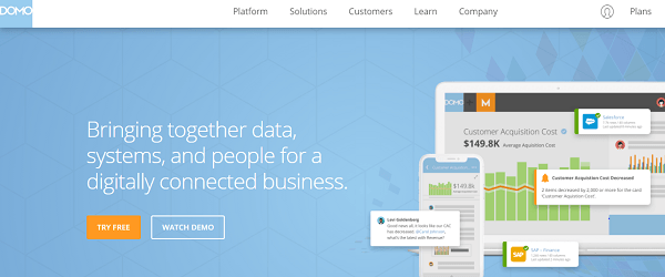
Domo:
Domo is mobile-supported and digitally connects the data, people, and systems when all are on the same page. Can do both macro and micro analysis visualizations by using Domo.
Conclusion
Data visualization is the most significant aspect for any brand to serve their creative content for the targeted audience. It helps to make the conversion. To be successful in the marketing industry, then one should implement advanced strategies in creating exciting content to get the audience’s attaudience’sll: +91 9848321284
Email: connect@kiranvoleti.com